We’re currently doing the next six months worth of planning here at Linaro. I wanted a simple Gantt chart to show when a task is expected to start and finish and found a nice way of doing it using a LibreOffice stacked bar chart.
The trick is to make the first bar invisible and use it as an offset. Start with a table like this:
| Name | Start | Length |
| Investigate baz | 2 | 3 |
| Integrate bar | 3 | 4 |
| Add support for foo | 0 | 3 |
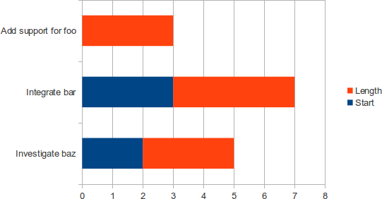
Select all of the data, then select Insert | Chart.... Select ‘Bar’ then the stacked bar chart. Click finish and you’ll see something like this:
Note how the rows are in an unfortunate bottom to top order. Double click on the blue part of any bar to bring up the Data Series dialog. Click on the Area tab, set the Fill to None, and you’ll get this:
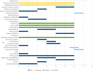
You can use extra columns to get extra colours. Here’s the final toolchain timings chart:
The spreadsheet this came from is available at:
bzr branch lp:~linaro-toolchain-wg/planning-1111


After you set the blue bar to be invisible, its name still shows up in the Legend. If you want that invisible too, go to the column header (in this case, “Start”) and replace it with whitespace. You need to actually type something in the column header, even if it’s just a space character. Otherwise, “Column A” (or whatever) will appear in the Legend.
Thanks for the tip. I think I put it through trusty ol’ Gimp in the end.
thank you for this simple, yet very useful explanation!